Website development can be both complex and time-consuming. AEM Core Components provide you with a comprehensive set of developer tools to build user-centric interfaces fast. These are web page building blocks that support responsive design by default and help optimize website performance.
In this article, we’ll explore how AEM Core Components shape website development and offer you insights into their benefits. See for yourself how they can streamline the creation of sites.
What AEM Components Are
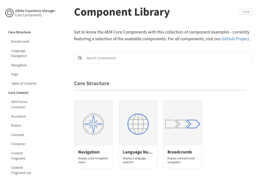
AEM Core Components are a set of standardized Web Content Management (WCM) elements specifically designed to streamline website development in AEM. For example, the grid component provides a responsive system for displaying content across web pages, and image sections simplify inserting images. Find the complete list in the AEM Component Library.
These pre-built components in AEM are designed with best practices in mind. Developers can use them to quickly assemble pages. They help ensure consistent quality, responsiveness, and adherence to accessibility standards.
Benefits of AEM Components
Let’s see what advantages your business gets when your website is being built using AEM Core Components.
Consistent Experience
AEM Core Components provide standardization, which reduces development time and effort. Using the pre-built pieces of pages speeds up your website’s time-to-market. With predefined layouts and design patterns, you can also maintain a cohesive look and feel throughout several online properties, which helps to enhance both brand recognition and user engagement.
For example, a multinational brand with an online presence spanning multiple regions and languages could use AEM Core Components to define consistent header and footer sections. These include logos, navigation menus, and contact information to ensure that visitors instantly recognize and associate these elements with the brand, regardless of which regional website they’re browsing.
Cost-Effective Maintenance
A standardized approach means cost-effective maintenance. You can easily apply changes across multiple pages, reducing the time and resources required for ongoing website management. This streamlined maintenance process translates to company cost savings.
Scalability and Flexibility
AEM Core Components are designed to be scalable and extensible. They provide a solid foundation for website development, allowing you to simply add new AEM features, integrate third-party tools, and adapt to your evolving business needs. This flexibility ensures that websites built with Core Components can grow and evolve with your business.
Optimized Performance
Because AEM Core Components are optimized for performance and SEO, they follow best practices for efficient rendering, caching, and structured data. This results in faster page load times and improved visibility in search engine rankings. An outcome of this is a better user experience and increased business organic traffic.
Types of AEM Core Components
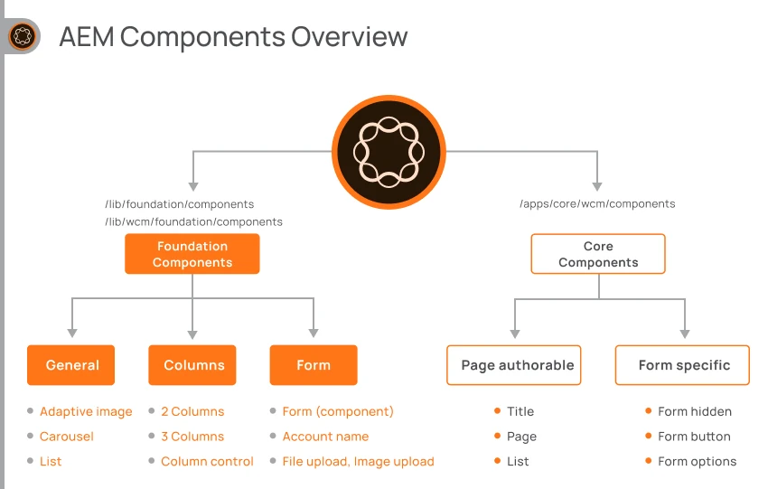
Let’s now turn to the different types of components in AEM. We can divide them into several groups: Structure, Content, Form, and Commerce components.
Structure AEM Components
With these structured AEM elements, you can create engaging and interactive web pages that captivate your audience:
- Navigation—serving as an important element in your website’s architecture, Navigation allows your users to easily explore your content. You can add Navigation to your page templates, headers, or footers to efficiently structure your site’s menu and ensure consistent navigation across all pages.
- Breadcrumb—enhances the user experience by providing clear and contextual navigation paths. Often placed near the top of a webpage, the breadcrumb element displays a hierarchical trail of links that map the user’s current location within the website’s structure.
- Language Navigation—providing a language and country navigation for a site, this piece allows visitors to navigate to the same page in a different locale. It is commonly added to a page template, in the header or footer.
Content AEM Components
From text and image to video players and social media widgets, these Content AEM Components offer versatile tools for delivering your content in compelling ways:
- Container—used to group other elements and apply a common layout or style. Choose to add a custom background image and color, and easily create sections or blocks of content cohesively.
- Buttons—allows you to create interactive and visually appealing buttons on your website with customizable styles, sizes, and actions.
- Accordion—enables users to toggle panels of related content.
- Title—used to create headings for a page or page sections.
- Text—facilitates the display of a rich text paragraph on the page, with various formatting options.
- Image—enables the display of a single image asset on a web page. Automatically selects the appropriate image width based on the screen size of the device. It also supports lazy loading, which optimizes page performance by loading images only when they are about to become visible to the user.
- Teaser—groups an image, title, and description for promoting and linking to site content sections.
- List—displays a list of pages by search query, tags, or from a parent page.
Form AEM Components
AEM Forms are specifically designed to streamline the creation and management of forms on your website:
- Form Text—allows you to create different input fields to collect information for later use—such as single-line fields, multi-line text areas, or password fields. Choose to customize the appearance and behavior of text fields.
- Form Options—create a form with different option layouts, such as selectable choices—radio buttons, checkboxes, dropdown menus, or even custom-designed option groups to match your branding.
- Form Button—enables user interactions and facilitates data submission by serving as actionable elements—prompting users to perform specific actions such as submitting a form, resetting form fields, or triggering custom functions.
Commerce AEM Components
These elements enable seamless integration with e-commerce platforms, empowering you to create engaging product listings, shopping carts, checkout processes, and more:
- Product—provides a comprehensive and visually appealing representation of individual products—including product images, descriptions, prices, and any other relevant details.
- Related Products—enables you to increase cross-selling opportunities by displaying complementary or similar products alongside the main product. Automatically generate recommendations based on predefined rules, product categories, or user behavior.
- Product Teaser—displays product teasers on any AEM page linking to the product details page.
- Search—configure to show a given number of products per page, or to dynamically load product prices in an additional browser query.
- Product Carousel—displays a list of featured products in a carousel style.
- Commerce Experience Fragment—encapsulating commerce-specific elements such as product listings, pricing information, promotional banners, and other commerce-related content elements.
For example, a commerce Experience Fragment could be a promotional banner highlighting a limited-time sale on a specific product category. This fragment can be easily reused across multiple pages or touchpoints, ensuring consistent promotion and messaging throughout the commerce website.
How a web page is built from components
Now we’ve covered the components, you’re going to want to learn how to build a web page from them.
Design with components
The process of building a web page using components involves several key steps that combine design and development elements. Here’s a simple overview of the process:
- Mockup. Create a visual mockup or wireframe of the web page layout based on the Core Components. This helps to establish the overall structure, design, and placement of the pieces.
- Design. Using a design tool such as Adobe XD, designers can work on the visual aspect—such as colors, typography, and imagery. With Adobe XD and Adobe Components, your creative team can create designs based on out-of-the-box tools.
- Configuration and style. Each section or element of the mockup is identified and matched with the appropriate component in the component library.
- Build a page of components. Developers start building the web page by assembling the pieces in the desired order, ensuring that the content and functionality are correctly implemented. The AEM style system provides a range of predefined styles and allows for customization to ensure visual consistency with the rest of the website.
Depending on the specific requirements of the project, you may want to customize certain elements to meet unique functionality or design needs.
Components in the AEM interface
Access the Components Console from Tools > General > Components. From there, you can browse through the list of components, and use search to quickly find a particular component of a group of them.
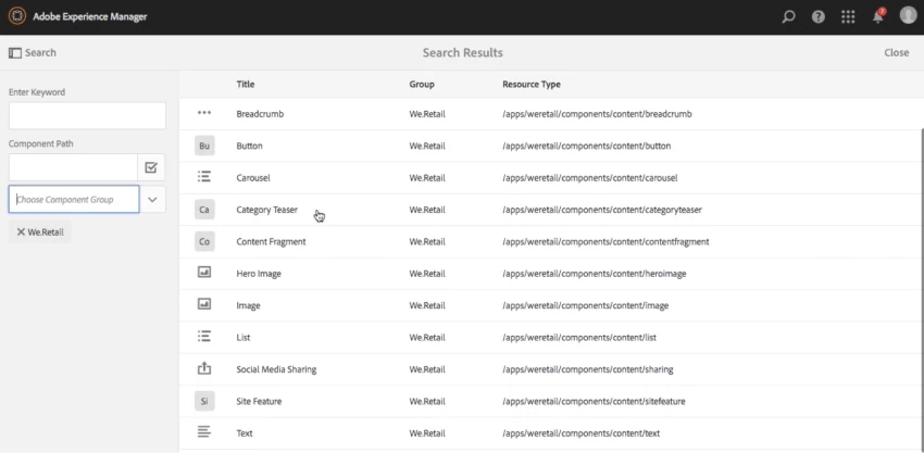
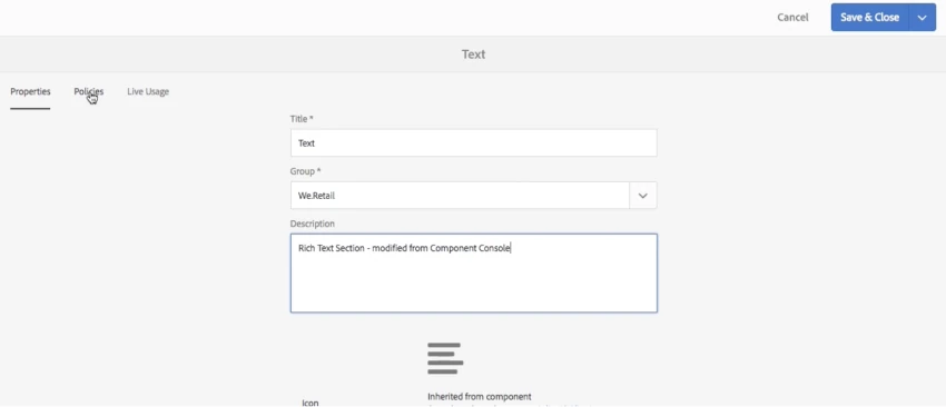
Select a component from the list and click through to view key information about it, such as the title, description, group, and a list of links to the live pages the component is being used on.
You can use components in a drag-and-drop editor, by putting them onto the desired section of the page.
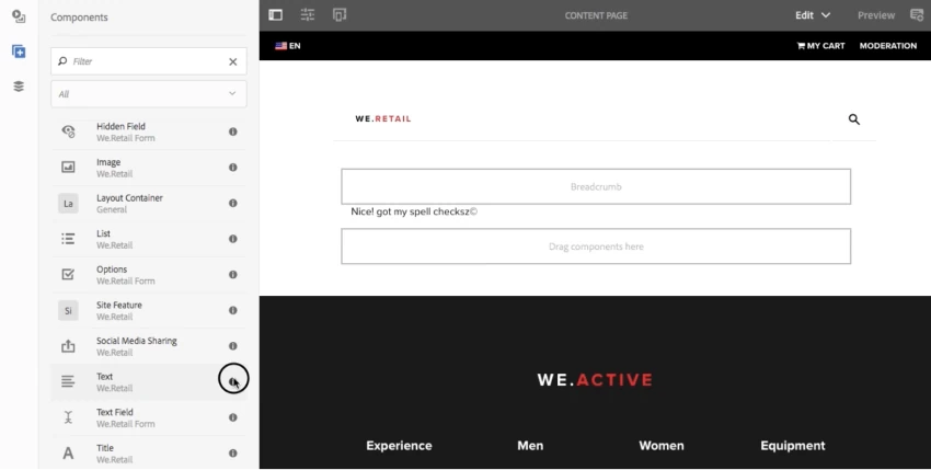
Once you’ve added a component to the page, you can configure its properties through a user-friendly form—such as specifying content, images, links, or other component-relevant settings.
Conclusion
Having explored this article, you’ll have an appreciation for how AEM Core Components deliver ready-to-use and standardized elements that will help you to make your website design and development process easier while maintaining high quality.
However, it’s important to recognize that having experienced AEM developers and access to AEM implementation services is crucial for achieving these fast and effective results. These specialist developers possess the necessary expertise to leverage AEM website elements efficiently, adhere to best practices, and ensure correct integration with the overall website architecture.
Customizing core elements to meet your specific business requirements or branding needs requires the knowledge and skills of experienced AEM developers. They can navigate the complexities of customization while maintaining their integrity, resulting in a website that is not only fast but also tailored to the unique needs of your business.
FAQ
What is the latest version of core components AEM?
The latest version of core components AEM is 2.22.12. This version is compatible with AEM as a Cloud Service and on-premise AEM installations.
How many components are there in AEM?
There are two sets of Adobe-provided AEM components—Core Components and Foundation Components. The comprehensive library contains more than 50 components.
What is the difference between core components and experience fragments in AEM?
Core Components in AEM are standardized building blocks for creating web pages and provide essential functionality for website development. Experience Fragments are reusable content modules that allow consistent content management across multiple channels and touchpoints.
What is the difference between Core Components and Foundation Components?
Core Components in AEM are pre-built elements for webpage development. Foundation Components form the framework of AEM and enable content authoring and management. Core Components focus on web page elements, while Foundation Components support the AEM platform.